.png)
How to Choose a Photography Print Using the Colour Wheel
- Nov 23, 2025
- 2 min read
Choosing a photography print for your home or workspace is more than picking an image you like—it’s about selecting colours that enhance your interior. The colour wheel is one of the easiest tools to help you choose artwork that feels intentional, balanced, and beautiful.
In this guide, you’ll learn how to use colour theory to select prints that complement (or contrast!) your décor perfectly.
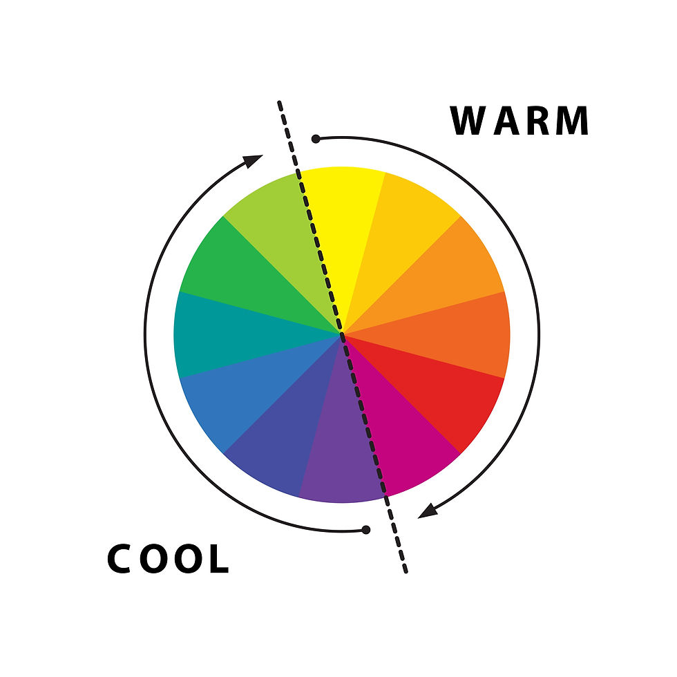
🎨 Understanding the Colour Wheel
The colour wheel is made up of:
Primary colours: Red, blue, yellow
Secondary colours: Green, orange, violet
Tertiary colours: The subtle hues between
These relationships help you choose artwork that blends harmoniously into a room or stands out as a bold focal point.
🔹 1. Complementary Colours (Opposites Attract)
Complementary colours sit opposite each other on the wheel—like blue/orange, red/green, or yellow/purple.
Why choose this?
Creates strong contrast
Makes artwork “pop”
Perfect for statement pieces
Example: A warm orange sunset looks stunning in a navy-blue room.
🔹 2. Analogous Colours (Soft and Harmonious)
Analogous colours sit side-by-side, like blue–teal–green or red–orange–yellow.
Why choose this?
Calming and cohesive
Great for bedrooms or minimalist interiors
Blends naturally with décor
Example: A green forest print in a room with sage or teal accents.
🔹 3. Monochromatic Colours (Elegant Simplicity)
Monochromatic palettes use shades of a single colour.
Why choose this?
Minimalist and modern
Easy to style
Ideal for neutral interiors or gallery walls
Example: A blue-toned seascape in a soft blue or grey room.
🔹 4. Triadic Colours (Balanced and Vibrant)
Triadic schemes use three evenly spaced colours on the wheel.
Why choose this?
Visually balanced but full of life
Ideal for creative spaces, eclectic homes, or kids’ rooms
Example: A colourful street scene with bold tones.
🏡 5. Start With the Colours Already in Your Room
Before choosing your print, take note of:
Wall colour
Sofa/furniture colours
Rugs and curtains
Accent pieces (pillows, vases, throws)
Then decide:
Do you want your artwork to blend? → Choose analogous or monochrome
Or stand out? → Choose complementary
💡 6. Consider Your Lighting
Lighting significantly affects how colours appear:
Natural light brings out cooler tones
Warm lighting enhances reds, oranges, and yellows
Check how your print looks in your room’s light at the time you use the space most.
🌈 7. Think About Saturation and Mood
Saturation influences energy:
High saturation: vibrant, modern
Low saturation: soft, calming
Black-and-white: timeless
Choose saturation levels that match your desired mood.